Internet Explorer and Edge, the Microsoft web browsers, also adapt the style of webpages according to this setting. Up until recently, this is how Da Button Factory looked like in Edge when high-contrast (dark theme #1) was on:

Quite… ugly, isn’t it? And the colorpicker was completely unusable.
Fortunately, web developers can influence how things get rendered. Interested developers: take a look at the
-ms-high-contrast-adjust CSS property, the -ms-high-contrast CSS media, and this helpful “Working with High Contrast” slidedeck.After a bit of tweaking, we could get to this:
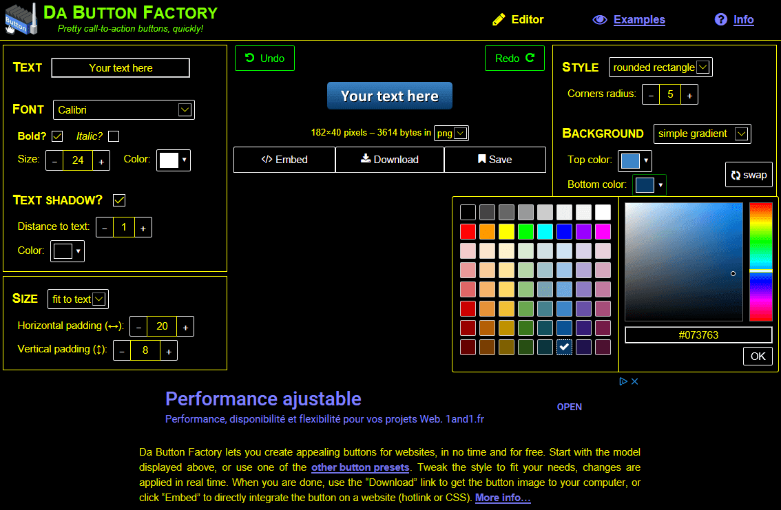
Much better. And it also looks good in High-Contrast white:

👍 for accessibility!

